
Election analysis for U.S. richest and poorest counties, 2016-2022
Ballotpedia reports on the 50 richest and 50 poorest counties in the U.S. and their voting trends since 2016.
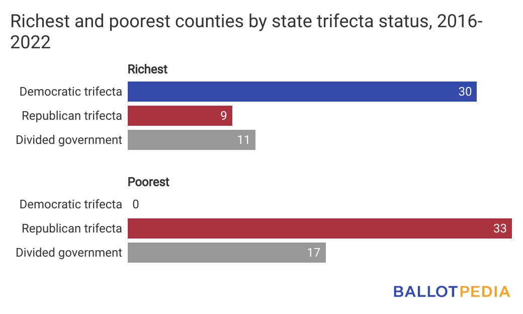
Among the 50 richest counties in the United States, the majority (30) were in states with a Democratic trifecta, nine were in states with a Republican trifecta, and 11 were in states with a divided government. A majority of the 50 poorest counties (33) were in states with a Republican trifecta and 17 were in states with a divided government, Ballotpedia reports. None of the 50 poorest counties were in states with a Democratic trifecta.
There are 3,143 counties and county-equivalents in the United States. There are also 41 independent cities in Virginia that operate independent of any county and are included in this study.
Based on 2021 census estimates, the 50 richest counties have a median household income of more than $105,000 and an average population of 492,000. The 50 poorest counties all have a median household income of less than $35,000 and an average population of 13,000. This page analyzes the voting trends of these counties from 2016 to 2022 to look at how partisanship and voter participation relate to county income.
- Among the 50 wealthiest counties, Democrats received a higher average vote share in 28 counties. Averaged election results trended toward Democrats in 26 counties, toward Republicans in 20 counties, and four counties were swing counties.
- Among the 50 poorest counties, Republicans received a higher average vote share in 26 counties. Averaged election results trended toward Democrats in 25 counties, toward Republicans in 20 counties, and five counties were swing counties.
- An average of 46.3% of the population voted in the elections included in this study in the richest 50 counties and 36.3% of the population voted in the poorest 50 counties.
On this page, you will find an analysis of the election trends of the 50 richest and 50 poorest counties in the United States by median household income. This overview includes:
- Methodology
- A list of the richest and poorest counties
- How each of these counties voted across the course of this study
- Where counties are located by state trifecta status
- Voter participation statistics in each county
- The counties on this list that are also pivot Counties
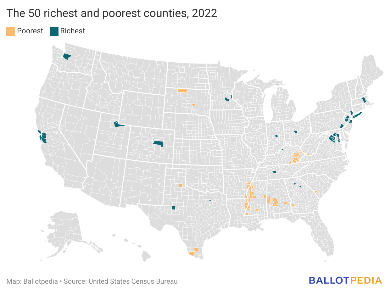
The map below highlights the 50 richest and 50 poorest counties based on the 2021 U.S. Census Bureau estimates.
Methodology
To determine the relationship between income and voting trends, Ballotpedia used the U.S. Census Bureau Small Area Income and Poverty Estimates Program's county estimates for 2021 of median household income for the 50 richest and poorest counties in the country. We also looked at election results for presidential, congressional, and gubernatorial elections from 2016 to 2022. The source for this election data was Dave Leip's Atlas of U.S. Presidential Elections.
To determine a county's partisan trends, we considered its frequency of support and margins of victory for each political party. Counties identified with either Democratic or Republican voting trends voted in support of the other political party two or fewer times across the included elections. We define swing counties as counties that voted in support of each of the majority political parties at least three times across the included elections.
Trifecta is a term to describe single-party government, when one political party holds the governorship and majorities in both chambers of the state legislature. The trifecta status referenced in this study is the status as it was following the November 2022 elections.
Richest counties
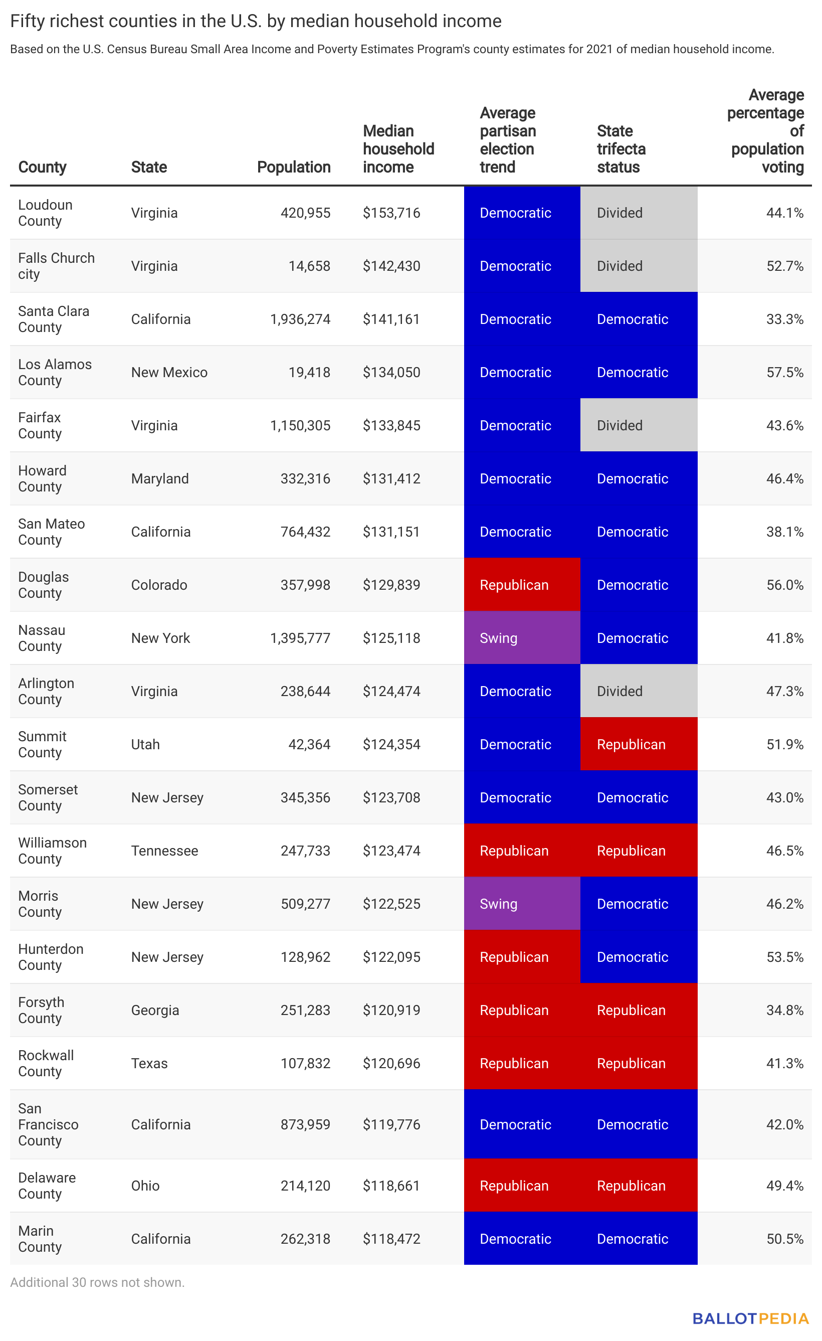
The table above displays the 20 richest counties in the United States according to median household income estimates from 2021, as well as which party the county tended to vote for, whether or not the county's state had a government trifecta following the 2022 elections, and the average percentage of the county's population that voted from 2016 to 2022.
Poorest counties
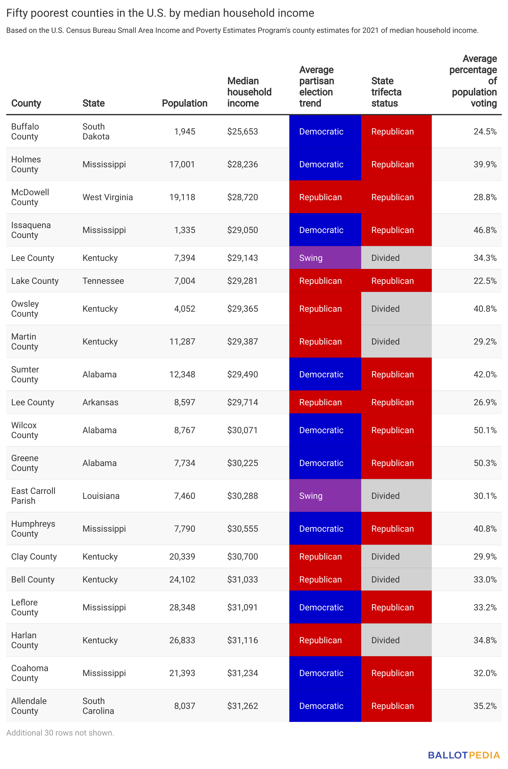
The table above displays the 20 poorest counties in the United States according to median household income estimates from 2021, as well as which party the county tended to vote for, whether or not the county's state had a government trifecta following the 2022 elections, and the average percentage of the county's population that voted from 2016 to 2022.
Counties by partisan election trends
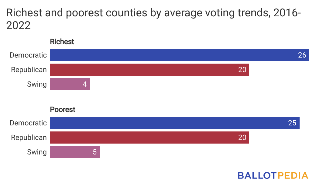
Among the richest and poorest counties in the nation, a majority of each tended to favor the Democratic Party. For the 50 richest counties in the nation, 26 favored the Democratic Party, 20 favored the Republican Party, and four were classified as swing counties. For the 50 poorest counties in the nation, 25 favored the Democratic Party, 20 favored the Republican Party, and five were rated as swing counties.
We define counties as swing counties if they voted in favor of each of the major political parties at least three times across the course of this study.
Richest counties
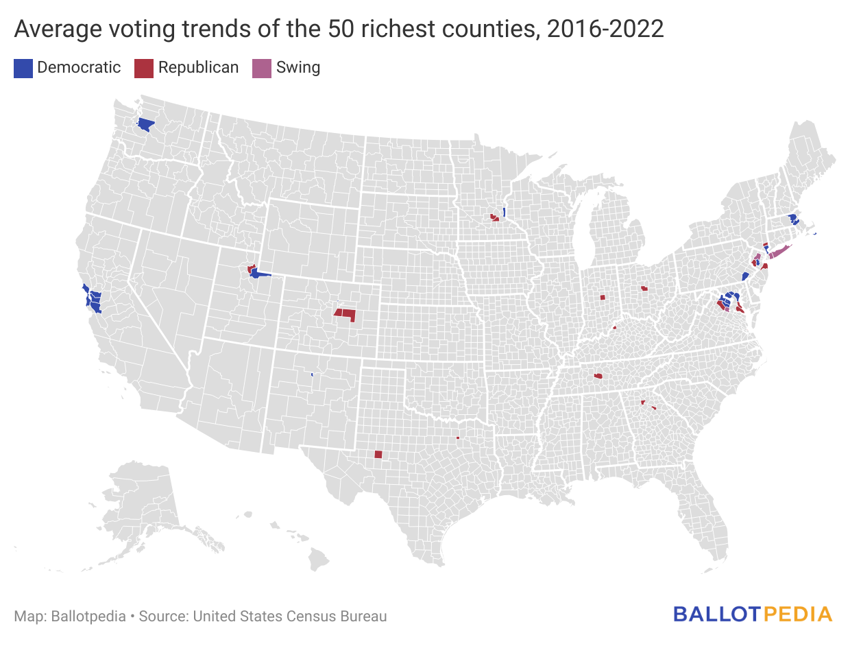
The map above shows the 50 richest counties and their partisan voting trend in regularly scheduled presidential, congressional, and gubernatorial elections from 2016 to 2022.
Average vote share
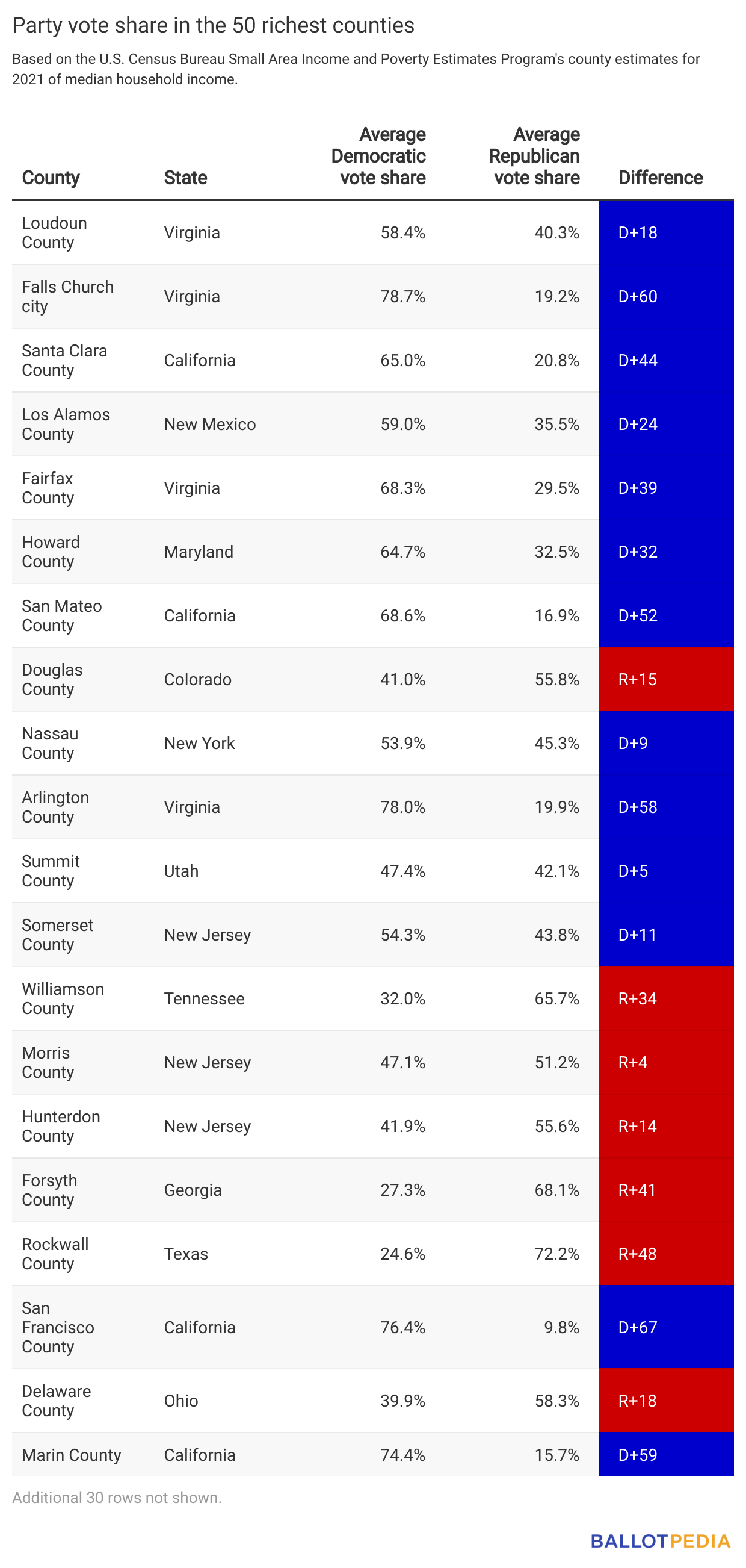
The table above shows the 20 richest counties, the average percentage vote for each political party in that county, and the difference between them expressed as a whole number.
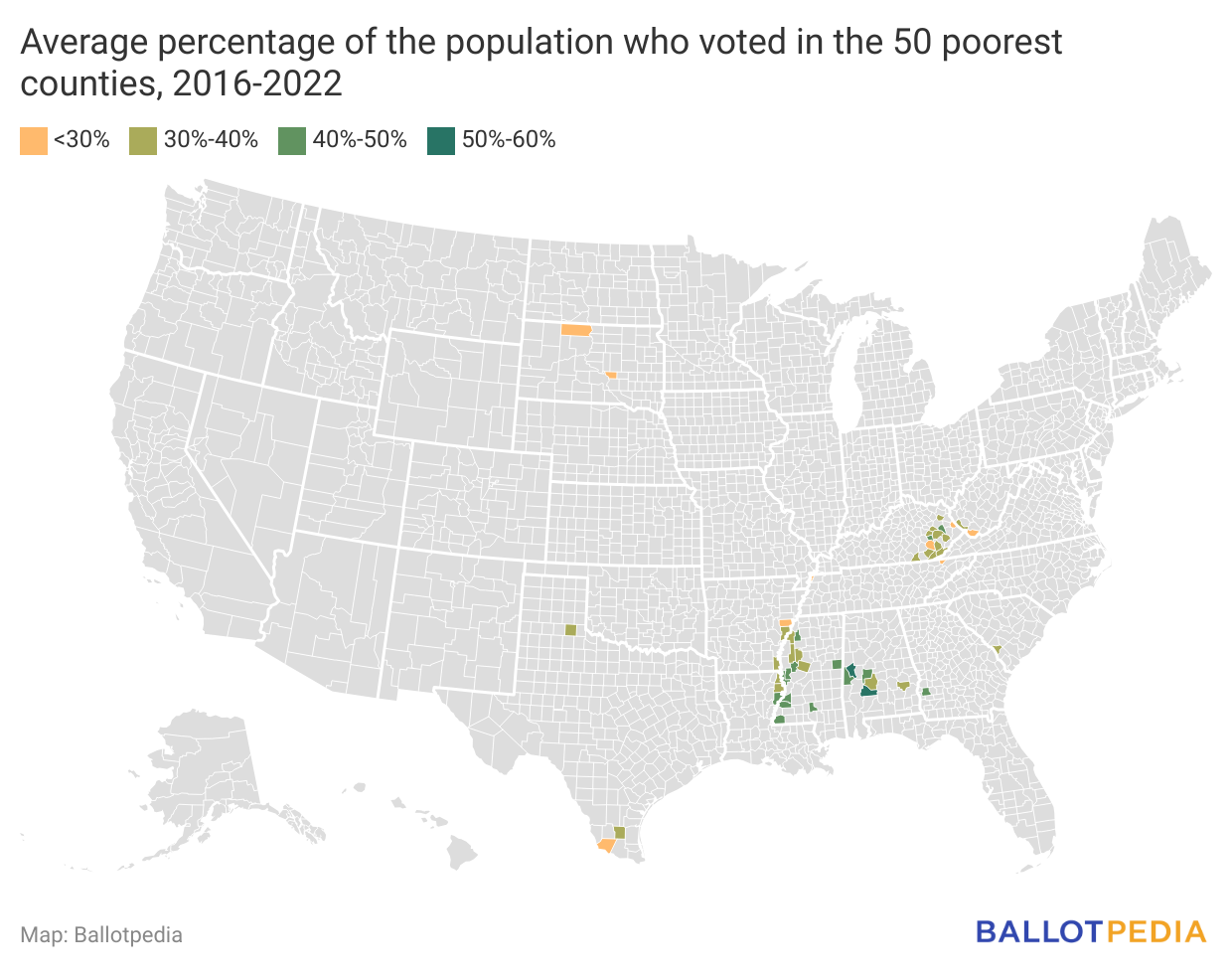
Poorest counties
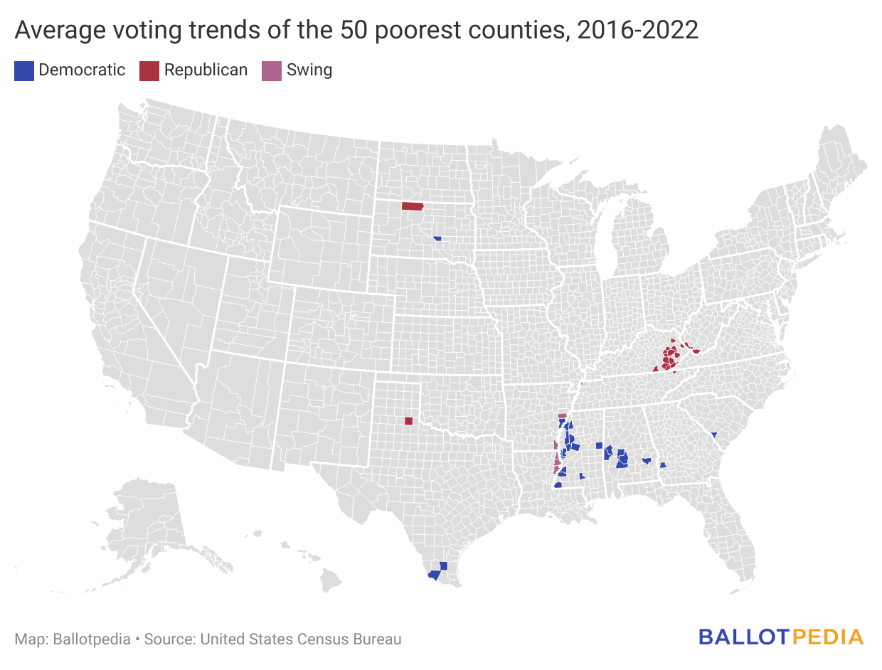
The map above shows the 50 poorest counties and their partisan voting trend in regularly scheduled presidential, congressional, and gubernatorial elections from 2016 to 2022.
Average vote share
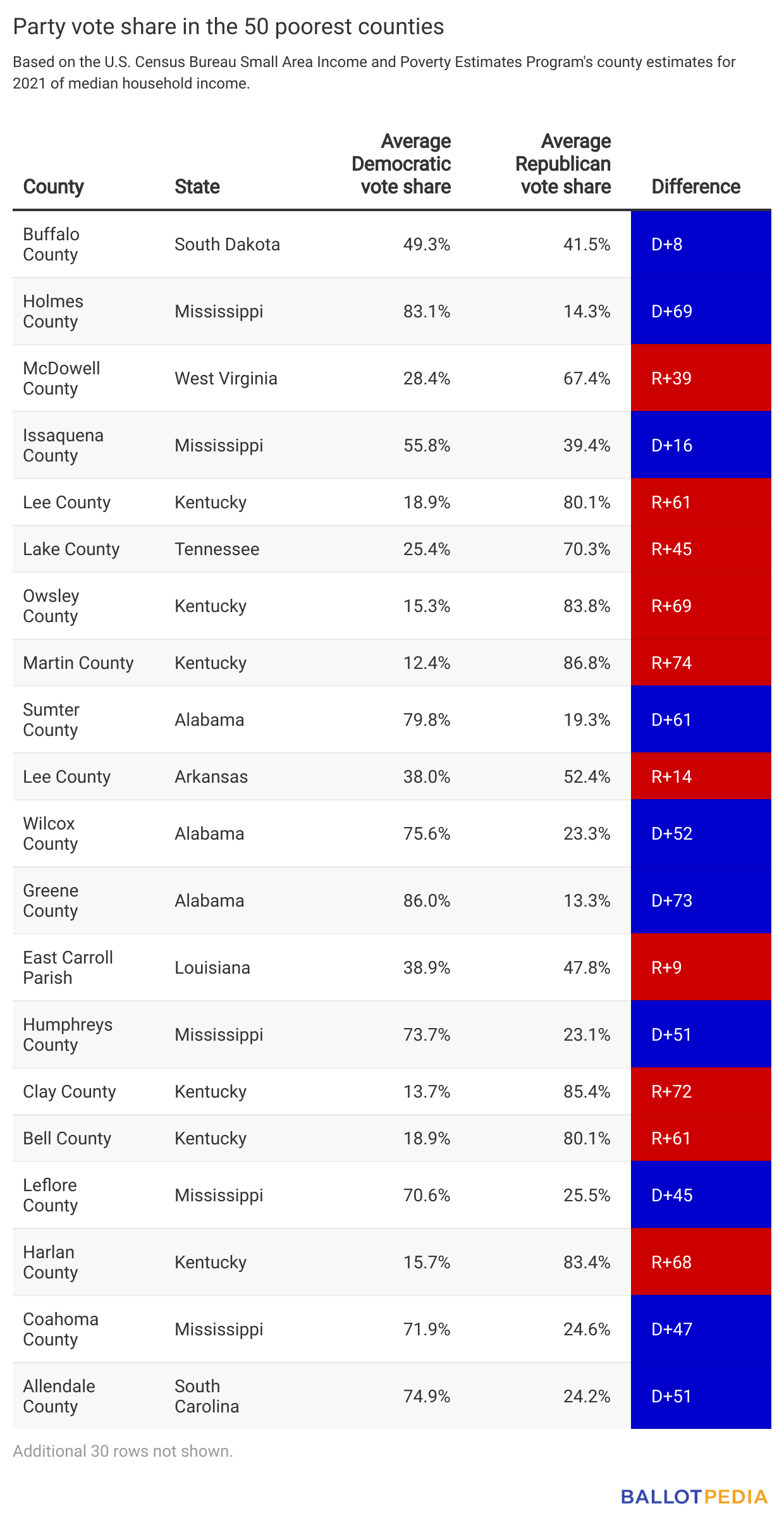
The table above shows the 20 poorest counties, the average percentage vote for each political party in that county, and the difference between them expressed as a whole number.
Counties by state trifecta status
A state government trifecta occurs when one political party holds the governorship and majorities in both chambers of the state legislature. As a result of the November 2022 elections, there were 22 Republican trifectas, 17 Democratic trifectas, and 10 divided governments where neither party holds trifecta control.
Of the 50 richest counties in the county, 30 were located in states with a Democratic trifecta, nine were in Republican trifectas, and 11 were in divided governments. Virginia, which had a divided government, had the highest number of the richest counties out of any state with nine. The richest county was Loudoun County, Virginia, with a median household income of $153,716 and was located in a divided government. The richest county in a Democratic trifecta was Santa Clara County, California with a median household income of $141,161, and the richest county in a Republican trifecta was Summit County, Utah with a median household income of $124,354.
Of the 50 poorest counties in the county, 33 were located in states with a Republican trifecta and 17 were in divided governments. Kentucky, which had a divided government, had the highest number of the poorest counties out of any state with 14. The single poorest county was Buffalo County, South Dakota, which had a household median income of $25,653 and was located in a Republican trifecta. Overall, the 50 poorest counties were spread across 11 different states. The poorest county in a divided government was Lee County, Kentucky with a median household income of $29,143.
Throughout the country:
- Virginia had the highest number of the 50 richest counties with nine.
- Kentucky had the highest number of the 50 poorest counties with 14.
- Overall, the richest counties were spread across 18 states, and the poorest counties were spread across 11 states.
Counties by voter participation
Across the 50 richest and poorest counties, richer counties tended to have a higher percentage of its population voting in elections than poorer counties. For the 50 richest counties, an average of 46.34% of the county population voted in presidential, congressional, and gubernatorial elections from 2016 to 2022. For the 50 poorest counties, an average of 36.26% of the population voted in those same elections.
The county with the highest percentage of the population that voted was Chester County, Pennsylvania, with an average 67% of the population. Chester County is one of the richest counties, with a median household income of $109,616. The county with the lowest percentage of the population that voted was Starr County, Texas, with an average of 18.8% of the population. Starr County is one of the poorest counties, with a median household income of $33,535.
Of the 50 richest counties, the county with the lowest percentage of the population that voted was Santa Clara, California, with an average 33.3%. Of the 50 poorest counties, the county with the lowest percentage of the population that voted was Greene County, Alabama, with an average 50.3%.
All four of these counties had an average partisan voting trend of Democratic.
Richest counties
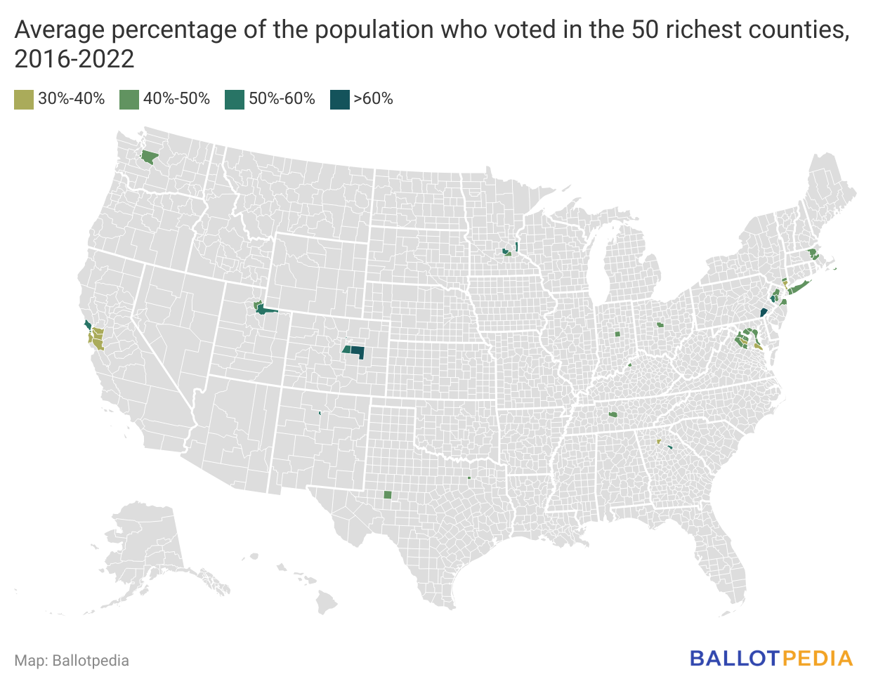
The map above shows the 50 richest counties and the average percentage of the county population that voted in presidential, congressional, and gubernatorial elections from 2016 to 2022.
Poorest counties
The map above shows the 50 poorest counties and the average percentage of the county population that voted in presidential, congressional, and gubernatorial elections from 2016 to 2022.
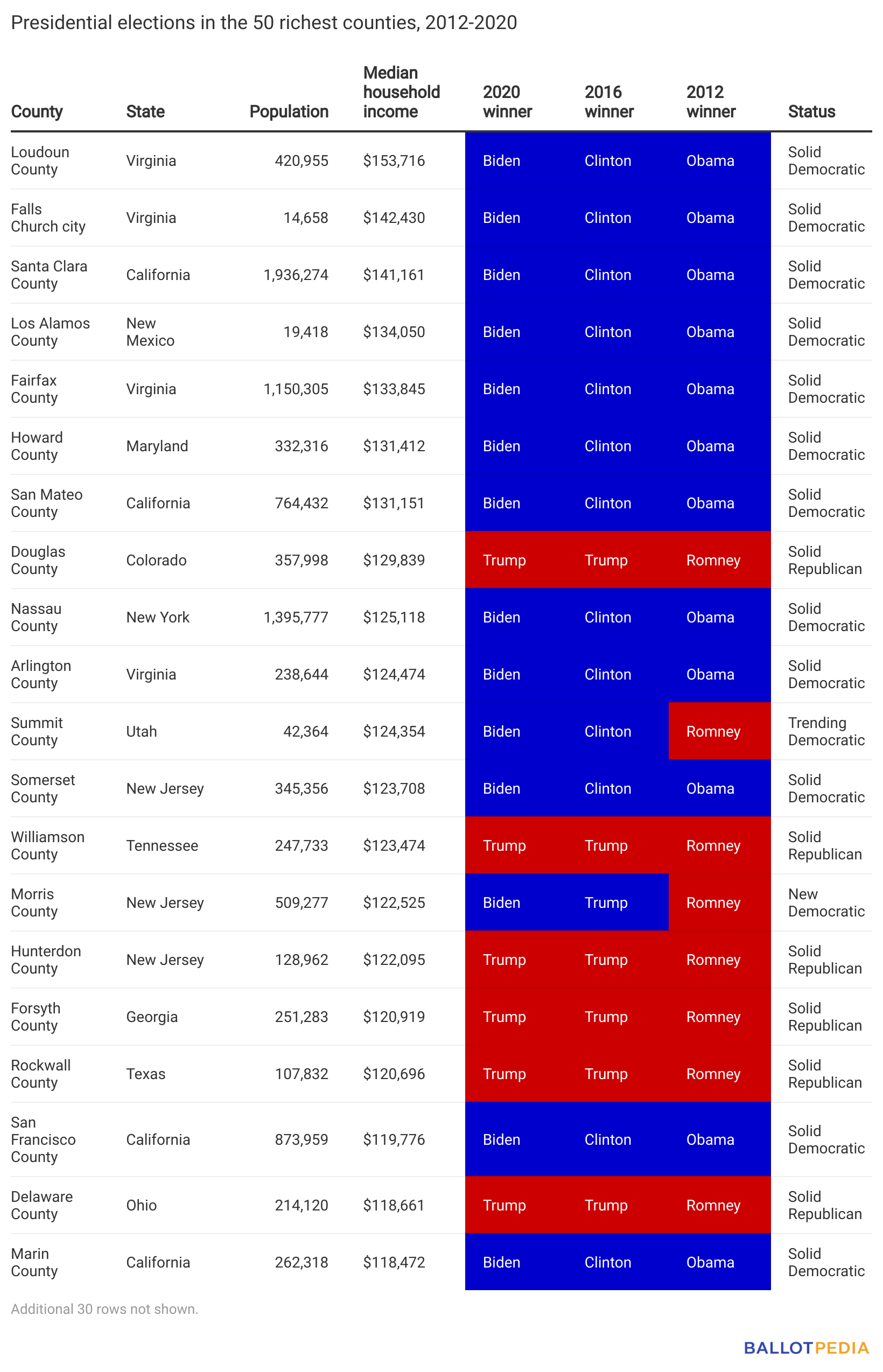
Richest counties

The table above displays the 20 richest counties and how each voted in each presidential election between 2012 and 2020.
Among the 50 wealthiest counties, there were:
- 24 Solid Democratic
- 20 Solid Republican
- 3 Trending Democratic
- 2 New Democratic
- 1 Trending Republican
Poorest counties
The table above displays the 20 poorest counties and how each voted in each presidential election between 2012 and 2020.
Among the 50 poorest counties, there were:
- 31 Solid Democratic
- 18 Solid Republican
- 1 Trending Republican
This story was produced by Ballotpedia and reviewed and distributed by Stacker Media.